[ UNDER/CONSTRUCTION ] - LAST UPDATED: 04.08.2026

Working at Zinus allowed me to dive deep into several exciting projects. We revamped the e-commerce experience to make it not just user-friendly but truly engaging. From the website's redesign to refreshing marketing strategies and packaging, we made things more efficient, cutting down on project time by 20% and boosting sales.
2019 - 2024


TYPOGRAPHY
The existing guidelines were too loose, which led to inconsistent typography across channels. I created a modular type scale, clearer typesetting rules, and a structured heading hierarchy to make the system easier to use and more consistent.

COLOR
The original palette was limited and difficult to use accessibly. I expanded the primary and secondary colors, added a stronger neutral range, and defined usage rules that gave teams more flexibility while improving contrast and consistency.

ICONOGRAPHY
The existing icon set was inconsistent and difficult to extend. I defined a simpler geometric style, created construction rules for stroke, corners, and detail, and expanded the library to more than 100 icons that could scale across product and marketing.

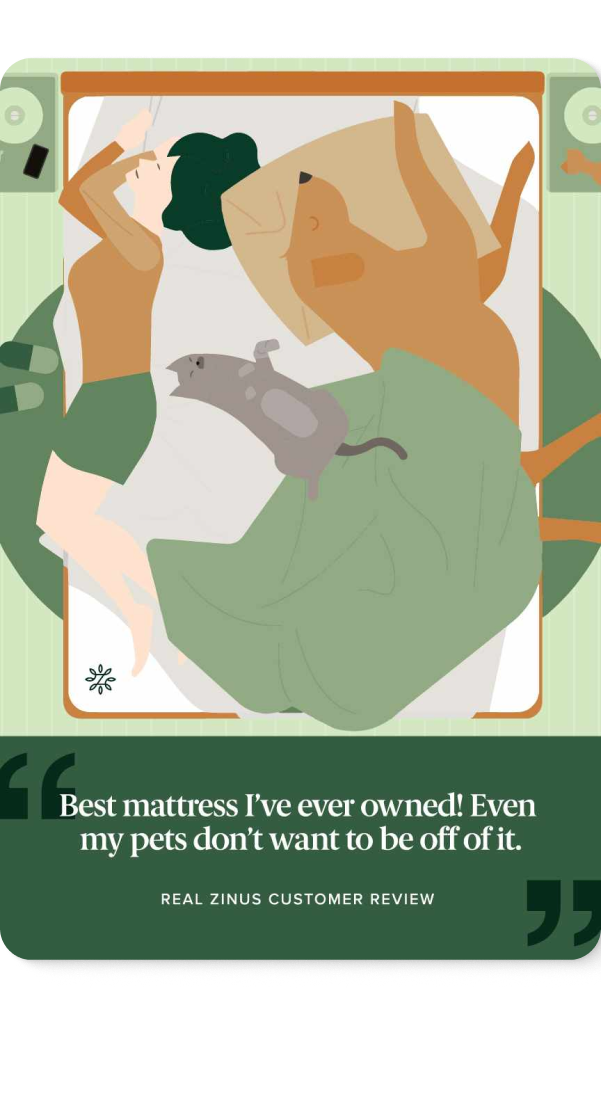
ILLUSTRATIONS
Illustration had no clear system, which made the visual language feel inconsistent. I introduced a defined palette, color ratios, and shared rules for line weight, detail, and finishes so new illustrations could feel recognizably Zinus.